For nearly a decade, Manhattan’s luxury kitchens have been dominated by white marble, matte white cabinetry, and pale grey everything. Clean. Minimal. Safe. But in mid-2026, something significant is happening across the Upper West Side pre-war co-ops, the Tribeca loft conversions, and the Carnegie Hill full-floor renovations that define the city’s most coveted residential market: color is back, and it is arriving with complete confidence.
Not the timid color of a single accent wall or a ceramic splashback detail. Deep forest greens, midnight navy, rich hunter tones, and saturated cobalt blues are taking over full cabinet runs – from base to upper, from island to perimeter. And the homeowners who have made this shift report something that aesthetics alone cannot explain: these kitchens feel different. They feel calming, energizing, and distinctly personal in a way that white never managed to achieve.
This is not a trend driven by Instagram or a seasonal mood board. It is rooted in color psychology – the science of how specific colors shape emotion, behavior, and daily perception in a given space. Understanding that science is exactly what allows KS Renovation Group to design kitchens that go beyond beautiful to become emotionally resonant spaces you never want to leave.
If you are planning a kitchen renovation or a mid-cycle refresh for your Manhattan apartment, contact KS Renovation Group to explore what bold color can do for your space.
The Science of Color Psychology in Manhattan Kitchen Design
How Your Kitchen Color Shapes Your Daily Emotional State
Color psychology is not soft interior design theory – it is neurological reality. The human bra
in processes color through the limbic system, the same region responsible for emotion, memory, and motivation. When you walk into a deep green kitchen every morning, your brain registers the hue before you register anything else, and it responds accordingly.
Green in its deeper registers – hunter, forest, emerald, British racing – activates associations with nature, stability, and renewal. Research in environmental psychology consistently links these tones to reduced cortisol levels and a measurable sense of groundedness. For Manhattan homeowners living at a relentless urban pace, that neurological pause is not a luxury. It is a daily necessity.
Rich blues – navy, midnight, slate, and cobalt – trigger a different but equally powerful response: calm focus. Blue reduces heart rate and promotes clear thinking, which is why it has historically dominated productive workspaces. In a kitchen that doubles as a morning hub, a homework station, and a weekend entertaining anchor, that cognitive clarity has real, practical daily value.
Why Kitchens Respond Differently to Color Than Other Rooms
The kitchen presents a unique challenge in color psychology because it operates under conditions that no other room in the apartment shares. Cooking generates steam and variable artificial lighting. Traffic is constant throughout the day. The room must function effectively at 7 a.m. when you are half-awake and at 9 p.m. when guests are gathered around the island.
The colors that perform best in this environment are not necessarily the ones that look most dramatic in a showroom. Deep greens and rich blues have a specific optical quality: they recede slightly rather than advance, which means they make a space feel calmer and more organized even when it is in active use. In the galley kitchens and compact layouts typical of Manhattan pre-war apartments, this perceptual calm is a design asset, not a limitation.
The Manhattan Factor: Small Spaces and Color Confidence
One of the most persistent myths in New York apartment design is that small kitchens must use light colors to feel larger. This is partially true for very dark value tones – a near-black or very deep charcoal can compress a small room – but it does not hold for the mid-deep range where greens and blues live.
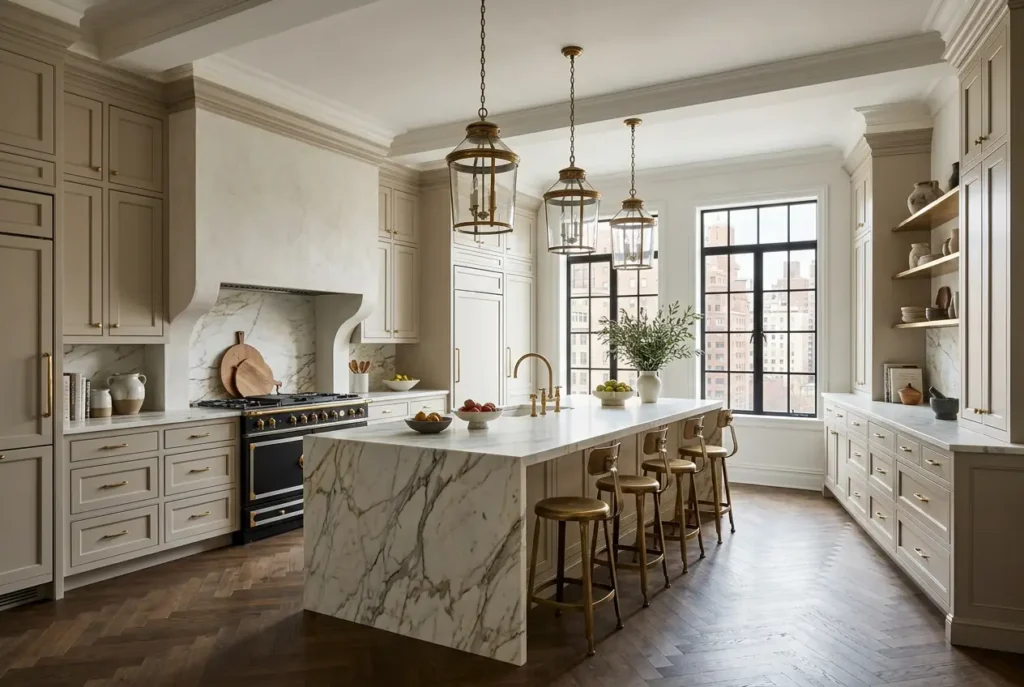
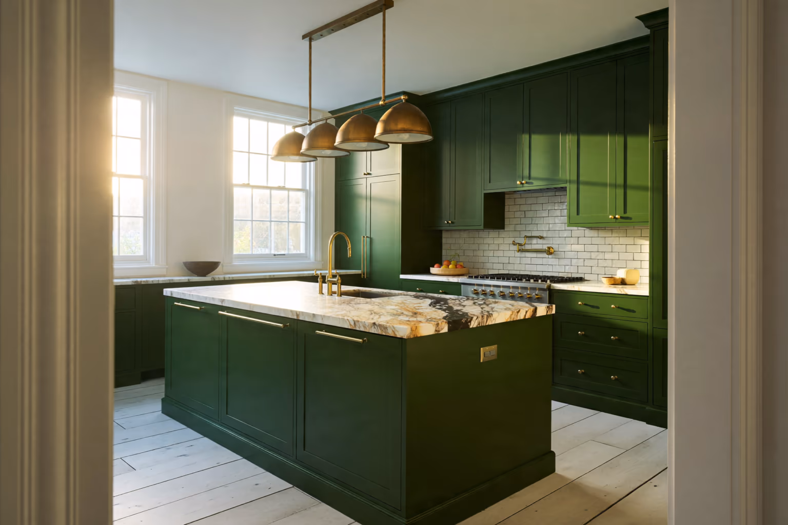
In a 100-square-foot galley kitchen in a Riverside Drive co-op, deep green lacquered cabinetry with warm brass hardware and a Calacatta marble backsplash creates a sense of luxury that white simply cannot generate. The kitchen does not feel smaller. It feels considered, finished, and intentional – three qualities that define Manhattan’s most compelling residential interiors and that command serious attention in the city’s luxury real estate market.
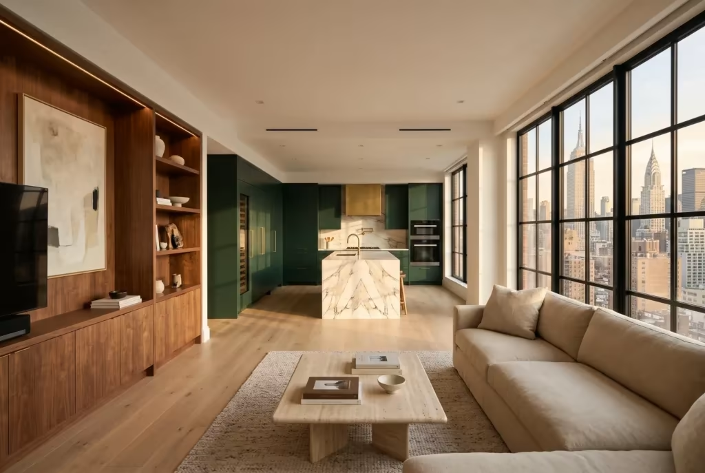
Deep Greens: Manhattan’s Most Transformative Kitchen Color in 2026
Understanding the Green Spectrum From Sage to Forest
Not all greens perform equally in a kitchen environment, and the specific tone matters enormously. Sage and soft muted greens read as neutral-adjacent – they pair easily with almost anything and carry minimal emotional risk. At the other end, very bright or highly saturated greens can feel jarring and tend to date quickly.
The sweet spot for Manhattan luxury kitchens in 2026 sits in the deep-to-rich middle: hunter green, forest green, deep olive, and dark botanical tones. These colors have enough depth to feel intentional and rich, but enough grey in their undertone to sit calmly in the space without overwhelming the surrounding architecture. Farrow & Ball’s Chappell Green and Studio Green, along with Benjamin Moore’s Tarrytown Green and Black Forest Green, represent the palette that designers across Manhattan’s luxury residential market are specifying at the highest rate this year.
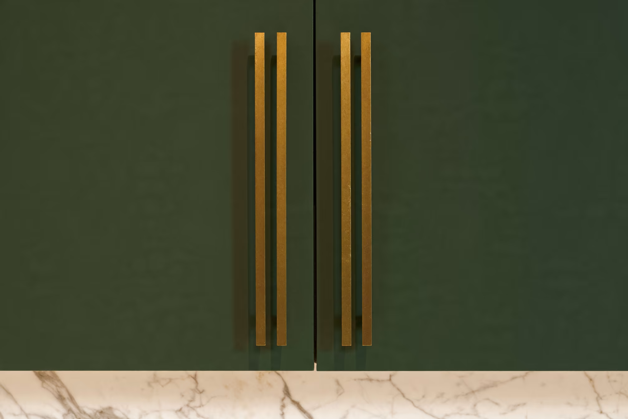
For cabinet finishes at KS Renovation Group, these tones are typically applied in matte or satin lacquer – finishes that absorb light rather than reflect it, which enhances the depth of the color and eliminates the slightly plastic quality that semi-gloss can introduce at scale.
How Green Performs in Pre-War Manhattan Light Conditions
Manhattan’s pre-war apartments were designed before modern lighting expectations existed. Many face north or have windows obscured by adjacent buildings. This means that the ambient light in a typical Upper East Side or Upper West Side kitchen is cooler and more diffuse than the warm, directional light you might encounter in a Tribeca loft or a contemporary high-rise.
Deep greens with slightly warm or olive undertones perform exceptionally well under these conditions. They absorb the cool cast of northern light and return warmth rather than going flat or muddy. By contrast, greens with strong blue undertones – teals and blue-greens – can look grey and lifeless under the same conditions.
If your kitchen has good southern or western exposure, you have considerably more latitude. In these spaces, even richer and more saturated greens read beautifully, especially when balanced with a warm natural stone countertop and unlacquered brass or antique bronze hardware that picks up and amplifies the afternoon light.
Combining Deep Green Cabinets With Natural Stone and Custom Millwork
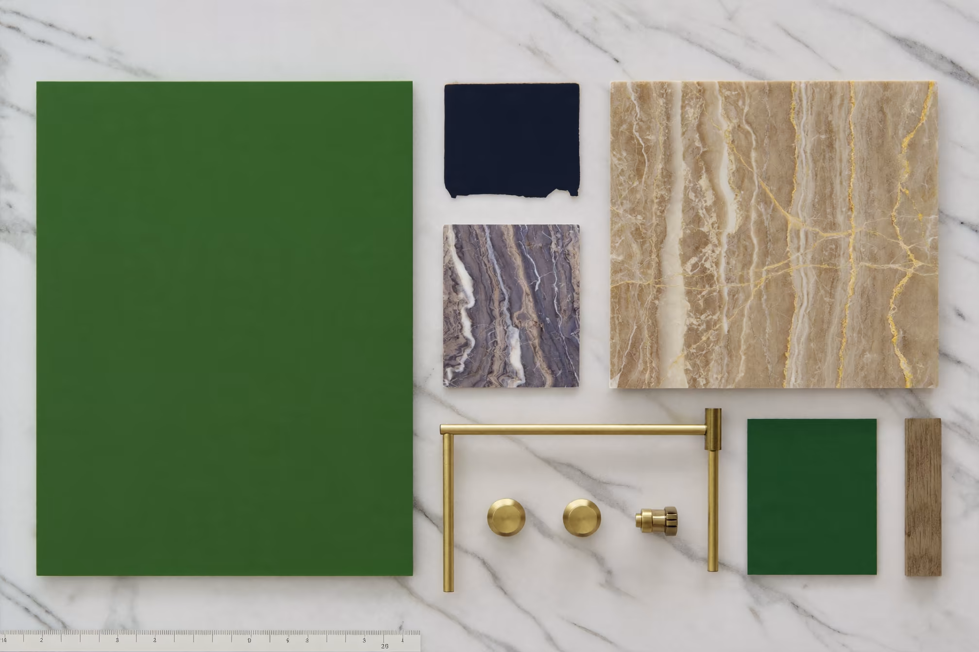
The material pairings that surround deep green cabinetry determine whether the kitchen reads as genuinely luxurious or simply colorful. The combinations that consistently produce the strongest results in Manhattan renovations follow a clear logic: cool greens need warm companions, and warm greens need either additional warmth or a crisp neutral to anchor the overall palette.
For deep hunter and forest greens, Remodelista’s kitchen design coverage consistently highlights Calacatta marble, warm white Thassos, or creamy limestone as the countertop materials that most successfully balance the depth of the cabinet color. The veining in Calacatta – particularly the warmer, gold-veined varieties – brings the entire palette to life and elevates the perception of quality in the space.
At KS Renovation Group, deep green kitchens often incorporate custom millwork elements that extend the design logic: open shelving in contrasting natural white oak, integrated panel-ready appliances that maintain the visual calm of the cabinet run, and statement kitchen islands in complementary tones. These bespoke elements are designed and built in our Long Island City facility, which means the millwork integrates with the specific tone and finish of the cabinetry at a level of precision that standard cabinetry cannot match.
Explore KS Renovation Group’s custom kitchen portfolio to see how deep green has been executed across a range of Manhattan apartment types and layouts.
Rich Blues: Calm Authority for the Urban Kitchen
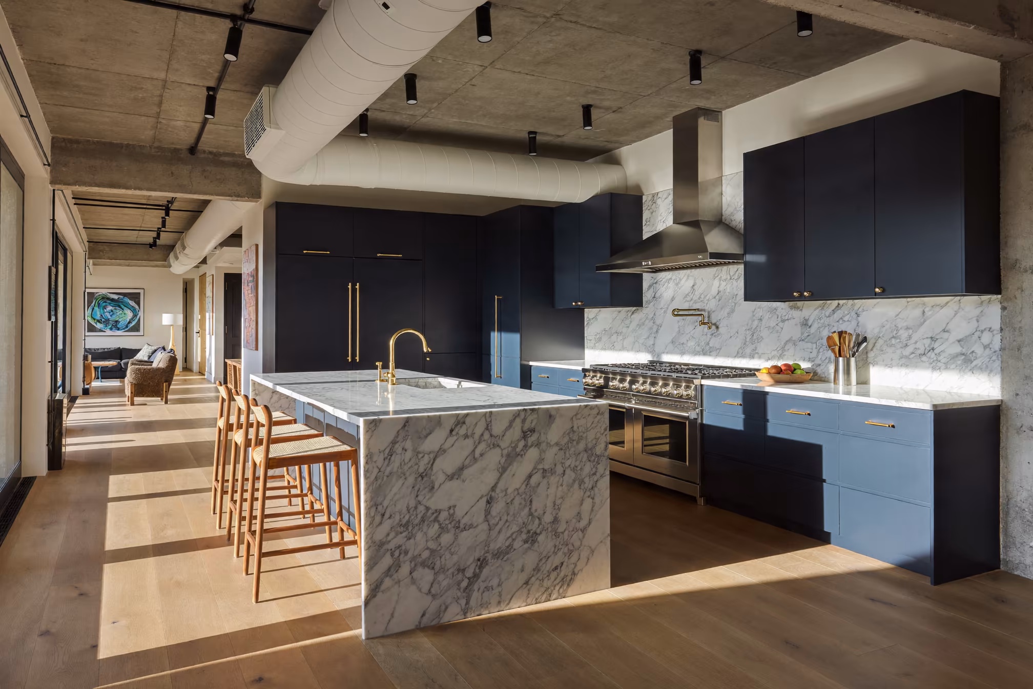
Navy, Slate, and Midnight Blue in Manhattan Luxury Kitchens
If deep green is the signature color of 2026’s mid-year design refresh, rich blue is its more established sibling – a tone that has been gaining consistent momentum in Manhattan luxury kitchens for the past two to three years and has now reached the point where it is specified by the city’s most accomplished interior designers as a default rather than a statement.
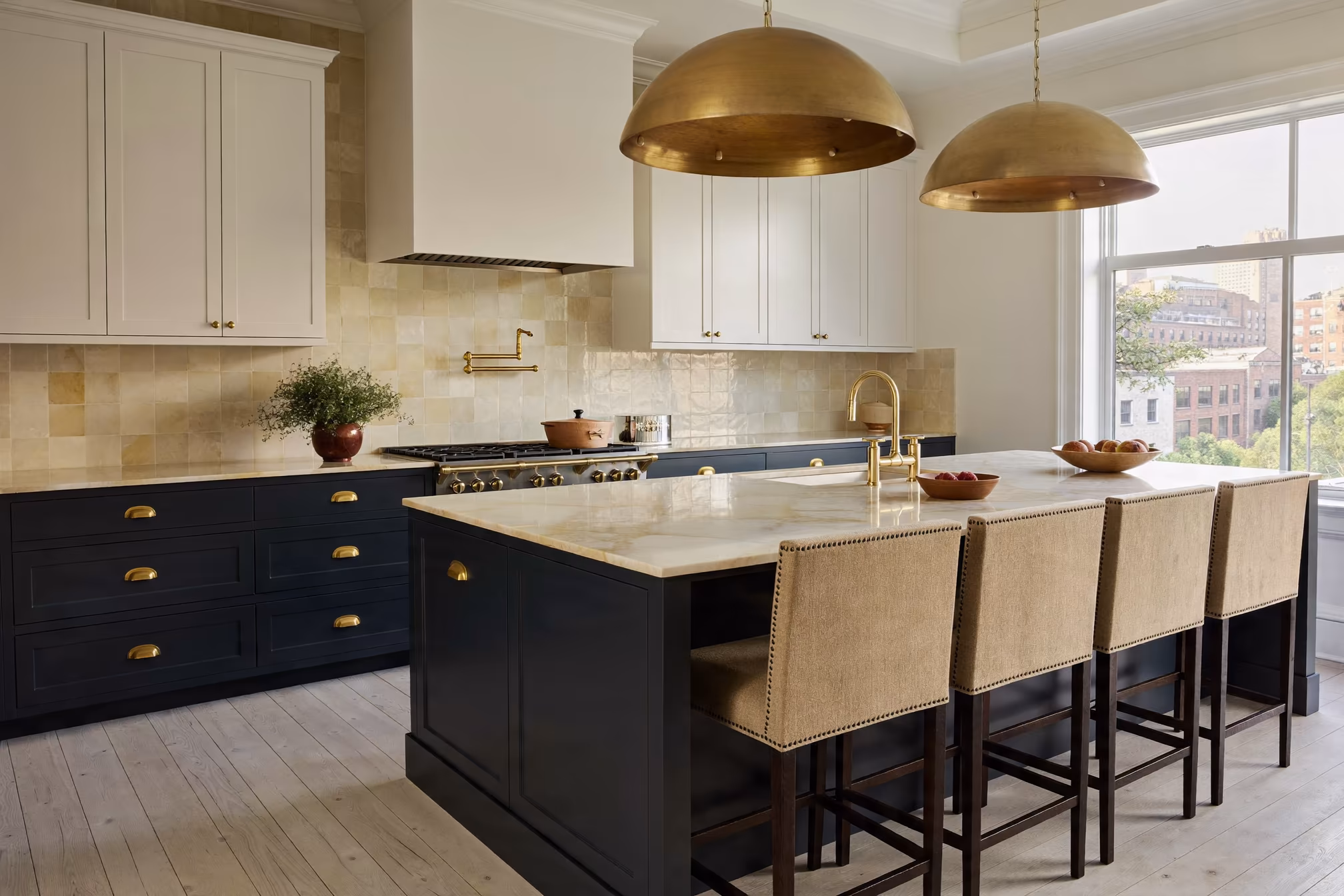
The blues performing best in Manhattan kitchens are not bright or primary. They sit in the deep, complex end of the spectrum: navy, midnight, denim, and slate blue. These are colors with enough grey or near-black in their composition to feel sophisticated rather than playful, and enough saturation to read as deliberate rather than accidental. The color does not shout. It declares.
Dezeen’s 2026 residential design coverage has cited deep blue cabinetry as among the top kitchen color movements internationally, a finding that is directly reflected in what KS Renovation Group’s clients are requesting across Manhattan’s co-op and condo market in the first half of this year.
The Psychology of Blue: Why It Works for Manhattan Homeowners Specifically
Blue’s psychological profile makes it a particularly strong choice for Manhattan residents. The city’s pace, density, and sensory load are unlike almost anywhere else in the United States. A kitchen that triggers calm, clear thinking, and a sense of genuine refuge from the urban environment is not just aesthetically pleasant – it is functionally valuable in a way that is difficult to achieve with neutral or light color palettes.
Deep navy kitchens consistently generate a specific response from the homeowners who live in them: the space feels like an escape. Not in the sense of avoidance, but in the sense of real restoration. That feeling is hard to manufacture with white or grey, which tend to recede emotionally as much as they do visually.
There is also an authority dimension to deep blue that resonates with Manhattan’s luxury residential market. Navy and midnight blue carry associations with quality, permanence, and precision – the same qualities that Manhattan co-op owners associate with high-grade craftsmanship and considered renovation investment. A deep blue kitchen communicates that the owner does not compromise.
Blue and Material Pairings: What Works in Manhattan Apartments
Deep blue cabinetry requires thoughtful material selection to prevent the space from reading as heavy or enclosed. The most successful pairings in Manhattan luxury kitchens consistently combine cool-toned blues with warmer countertops, backsplashes, and hardware.
Unlacquered brass and brushed gold are the dominant hardware choices in 2026 for deep blue kitchens – the warm metal provides the contrast necessary to prevent the cabinetry from reading as monolithic. Honed Calacatta or Statuario marble with warm veining, leathered quartzite in a warm sand tone, or a butcher block insert on the island all serve this balancing function effectively.
For flooring, white oak and warm-toned engineered hardwood consistently outperform stone tile as a companion to deep blue cabinetry in Manhattan apartments. The organic warmth of wood grounds the kitchen and prevents the visual weight of the cabinetry from dominating the entire room. In pre-war apartments where original oak floors survive, this pairing is often ready-made and exceptionally effective.
Executing Bold Color in a Manhattan Kitchen Renovation
Cabinet Finish Matters as Much as the Color Itself
In a deep green or rich blue kitchen, the finish quality of the cabinetry is significantly more exposed than in a white or grey kitchen, precisely because the depth of the color makes any inconsistency immediately visible. A matte or satin lacquer finish applied by an experienced fabrication facility will absorb light evenly across the door face and produce a surface that reads as refined from every angle and under every lighting condition.
Semi-gloss and high-gloss finishes in deep tones can be spectacular in the right context – particularly in contemporary Tribeca lofts or high-rise apartments with directional track lighting – but they require an exceptionally high level of millwork precision. Any variation in the door face becomes apparent as a light reflection discrepancy, which undermines the entire effect.
At KS Renovation Group, all cabinetry finishes are applied in our Long Island City facility under controlled conditions. This gives us the consistency that deep, saturated color tones demand – a standard that site-applied finishes cannot reliably achieve in occupied Manhattan buildings.
Working With Your Building’s Architecture and Regulatory Requirements
Manhattan buildings have specific renovation requirements that intersect with design decisions in ways that homeowners do not always anticipate. In buildings under Landmarks Preservation Commission jurisdiction, exterior-visible elements remain subject to approval, though interior kitchen cabinetry falls outside LPC scope.
More directly relevant to a bold color kitchen renovation are co-op alteration agreements, which typically specify requirements for countertop materials, ventilation upgrades, and plumbing modifications. The NYC Department of Buildings requires permits for any structural, mechanical, or plumbing changes regardless of aesthetic choices. Understanding these requirements early in the design process prevents delays and allows the bold color design to be built around confirmed specifications from the start.
Working with a renovation team that has deep experience in Manhattan’s building regulatory landscape means the design process for your bold color kitchen can remain focused on the design itself, rather than navigating compliance surprises mid-project.
Balancing Bold Color With a Neutral Backdrop
The most successful deep green and rich blue kitchens in Manhattan share a consistent structural principle: the bold color is concentrated in the cabinetry, and the surrounding environment is kept calm. Walls, ceilings, and floors in warm whites, soft creams, or natural wood tones allow the cabinetry to function as the intentional design statement it is, without competition from the surrounding surfaces.
This does not mean the rest of the kitchen is bland or overlooked. It means the visual hierarchy is clear and confident. The cabinetry is the feature; everything else is the setting. In pre-war Manhattan apartments, this hierarchy is often reinforced by the existing architecture – plaster walls, original decorative moldings, and early 20th-century oak floors provide a warm, textured backdrop against which deep green or navy cabinetry reads with maximum impact and enduring elegance.
Schedule a consultation with KS Renovation Group to discuss how bold color can be integrated with your apartment’s existing architecture, your building’s requirements, and your personal vision for the space.
Conclusion
Manhattan kitchens are changing, and the change is not superficial. The shift toward deep greens and rich blues in 2026 reflects a more sophisticated understanding of how residential spaces can and should serve the people who live in them. Color psychology is not an abstract design philosophy – it is the practical application of research about human neurology to the spaces where daily life unfolds.
The kitchens that KS Renovation Group designs in this palette are not trendy in the sense of being temporary. Deep forest green lacquer with unlacquered brass hardware and Calacatta marble is not a look that dates quickly. It is a look that deepens in meaning as it becomes more familiar – more yours – over years of mornings, dinners, and everything in between.
If you are ready to move beyond white and grey and into a kitchen that genuinely reflects the quality and intention that Manhattan living can offer at its best, KS Renovation Group is the team to call. Our custom millwork, in-house fabrication, and deep experience with Manhattan’s renovation landscape mean your bold color kitchen will be executed at exactly the level this city demands.
Contact KS Renovation Group today to start planning your 2026 kitchen renovation.
Frequently Asked Questions
Will a deep green or navy kitchen make my Manhattan apartment harder to sell?
Industry data suggests that well-executed bold color kitchens in Manhattan’s luxury segment consistently generate strong buyer interest, particularly when the color is applied at a premium finish quality and paired with high-grade materials. A deep green or navy kitchen designed and built by a skilled renovation team reads as a high-value custom feature that signals serious investment in the property, not a liability.
How does deep green or navy cabinetry perform in a north-facing Manhattan kitchen?
Deep greens with warm or olive undertones and navy tones with grey undertones both perform well under cool, diffuse northern light – the light condition most common in Manhattan pre-war apartments. The key is selecting the right undertone for your specific light conditions. A professional renovation consultation with KS Renovation Group includes a detailed assessment of your kitchen’s light environment to guide this decision.
Can I do a bold color kitchen if my co-op building has strict renovation rules?
Yes. Co-op alteration agreements govern structural, mechanical, and plumbing changes – not interior finishes or cabinet colors. A deep green or navy kitchen renovation is subject to the same approval requirements as any other kitchen renovation in your building, but the color choice itself does not trigger additional restrictions or require special board disclosure.
What hardware finishes work best with deep green and navy cabinetry?
Unlacquered brass and brushed gold are the dominant choices in 2026 for both deep green and navy kitchens. Aged bronze and antique brass also pair exceptionally well with green tones. Matte black hardware is a strong choice for navy in more contemporary Manhattan apartments. Polished chrome and bright nickel tend to read as too cold against the warmth that deep cabinet colors require.
Is it possible to refresh my existing kitchen with bold color without a full renovation?
In some cases, existing cabinet boxes in solid structural condition can be refinished in a deep green or navy, meaningfully transforming the kitchen without a full gut renovation. However, the finish quality that deep, saturated tones require demands professional application under controlled conditions. KS Renovation Group can assess whether your existing cabinetry is a strong candidate for a color refresh or whether new custom millwork represents the better long-term investment for your apartment.